Search for answers or browse our knowledge base.
Side-By-Side Yearly Comparisons Within Pivot Tables
Purpose
This document is designed to provide instructions for manipulating the standard Billings/Commissions report from SalesAnalysis, to show a side-by-side comparison of yearly sales data.
Prerequisites
- SalesAnalysis and AccountReporter licenses
- Microsoft Excel 2007 or later
- Basic understanding of how to run a Billings/Commissions Report.
Running the Report
Run a “Billings/Commissions” report in SalesAnalysis, using a two-(calendar)year date range, such as in the example below.

The steps and screenshots below will use the “Billings Table” tab of the resulting Excel Workbook, however the tips may be used on any of the various pivot table tabs.

Manipulating the Report in Excel 2007 or Later
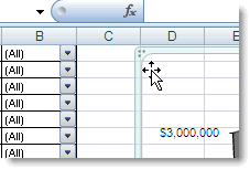
1. Click and drag the chart area further to the right, or delete if desired. This is to make room for the additional columns you’ll be creating in the Table area.
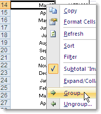
2. Right-click any one of the dates in the Invoice Date column. Choose “Group and Outline” then “Group”. (Excel 2007 users, right click and choose “Group”)
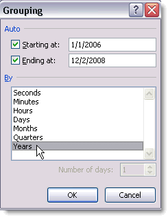
3. Click on “Months” to de-select it. Then click on “Years” to select it (notice grey bar indicating your choice). Click “OK.”
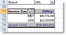
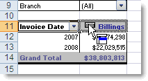
4. Click on the column label “Invoice Date” and drag it to hover over the word “Billings” and let go.

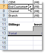
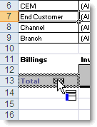
5. Now, bring desired data category from upper left corner into the table (i.e. Customer, Principal, etc.). The first category brought down must be dropped over the word “Total” to establish that first column.
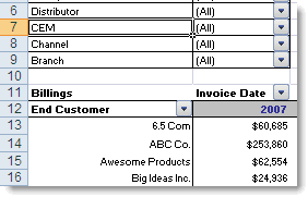
Optional: Additional fields can still be brought down into play such as Principal, Account Manager, etc.
